Online store · Brand identity · Motion
Pure Flame
The art of gathering
A digital experience for outdoor living. Sculptural fire tables, warm materials and quiet editorial layouts come together in a visual e-commerce journey for PureFlame.
The project covers the online shop — homepage, collection, product and about pages, on desktop and mobile — and the identity around it: the hand-lettered wordmark, the flame mark, colour, typography and a logo animation for the site.
- Year
- 2026
- Scope
- E-commerce, UI/UX, art direction, identity, logo animation
- Platforms
- Desktop & mobile
- Type
- Portfolio concept
- Build
- HTML/CSS/JS front end, Node.js + Express back end, Stripe in test mode
Built with
 HTML
 CSS
 JavaScript
 three.js
 Node.js
- Express
 Vercel
 GitHub
Made with
 Photoshop
 Illustrator
 After Effects
 Premiere Pro
 Blender
 Claude
 Codex
Website
The homepage opens on a full-screen film under a single line — “Ignite the moment” — then moves through the collection, the evening ritual around the fire and a guide that helps you choose a table by the size of your terrace.
The about page tells the story behind the tables: the idea, the materials — flame, glass, stone — and the people who make them.
Collection
The collection page presents the five models — Embera, Aether, Flavo, Fera and Ignite — as large lifestyle compositions with a full-screen gallery view, followed by a side-by-side comparison of their proportions and the accessories.
Product pages
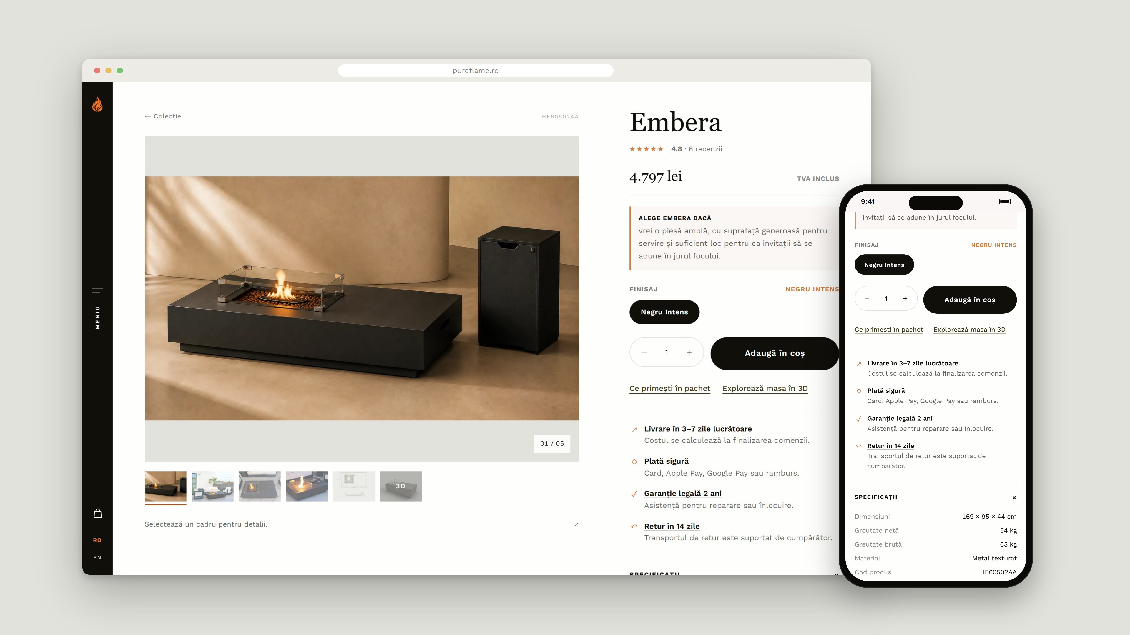
Each table has its own page: a gallery with every angle, the finish selector and the buy box — with delivery, secure payment, the two-year warranty and 14-day returns spelled out right next to the price.
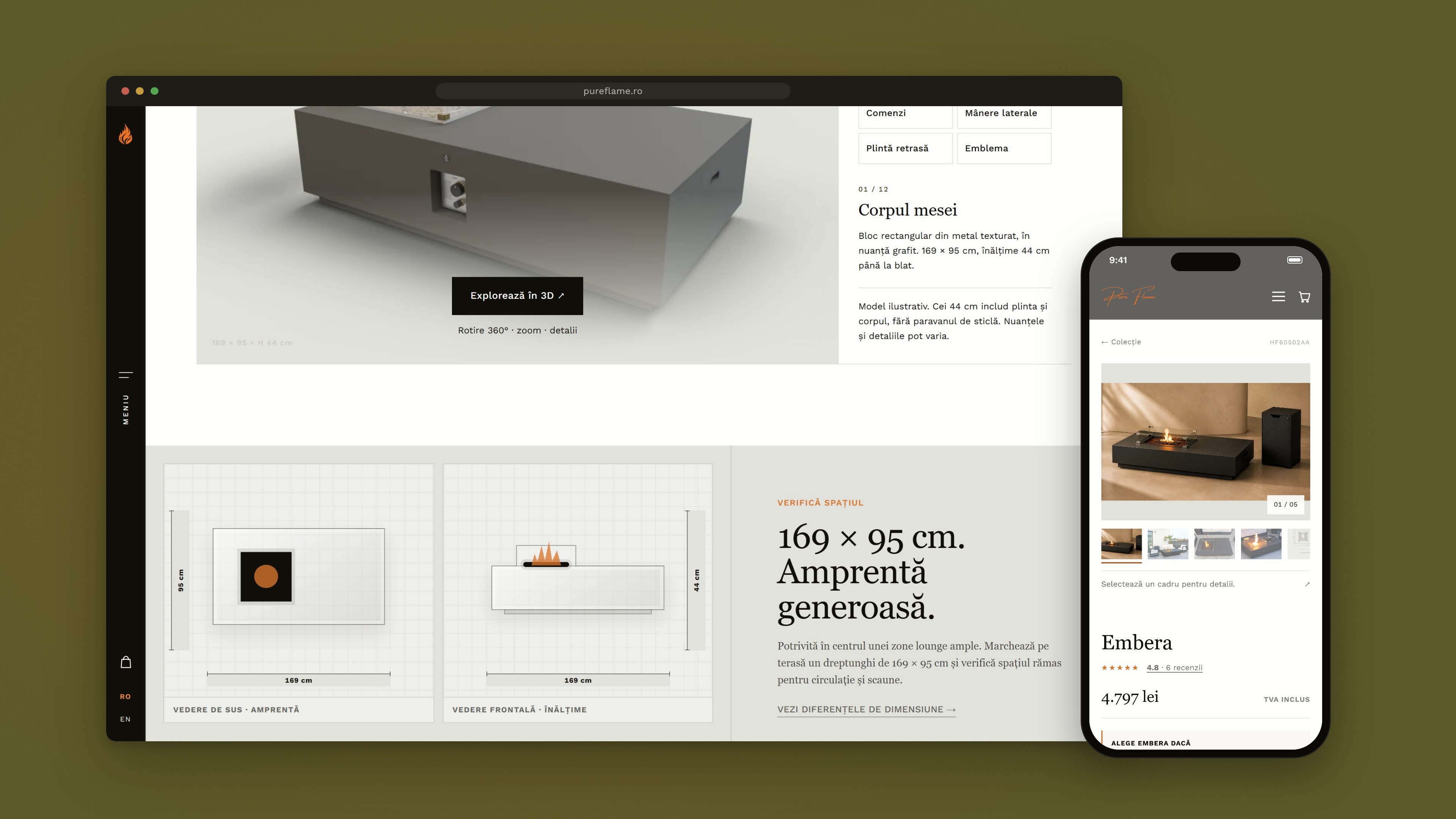
Further down, a 3D viewer and dimension drawings — top view for the footprint, front view for the height — help judge the table against a real terrace before ordering.
Mobile
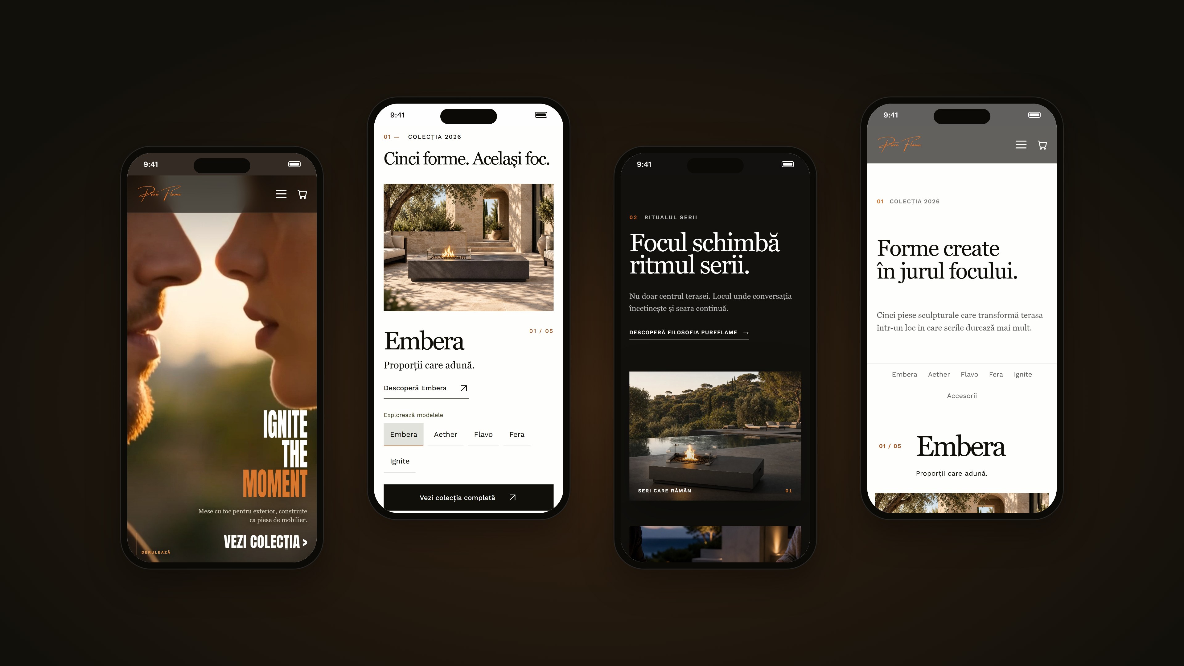
On a phone the pages keep the same editorial rhythm — the film-led hero, the collection and the product pages — with the menu and the cart always one tap away.
Identity
The hand-lettered “Pure Flame” wordmark and the flame mark come straight from the logo master file. In the animation the flame ignites, then the signature is written in its original stroke order — exported with a transparent background so it can open the site itself.
Charcoal, olive, ember, brass and cream carry the warmth of the product. Georgia gives the brand its editorial voice; Work Sans keeps the interface quiet and legible.